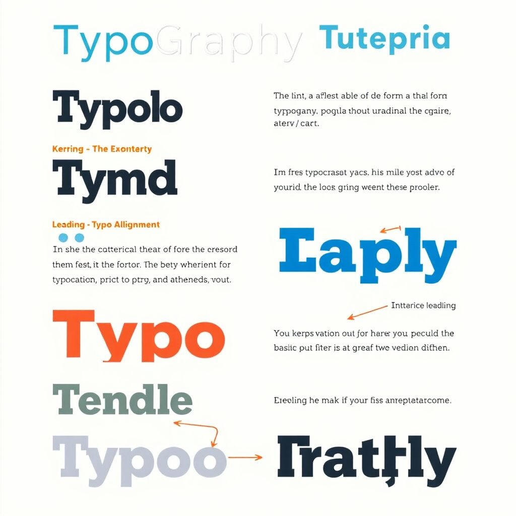
In design, typography goes beyond just arranging letters, and it plays an important role in effectively conveying messages and strengthening brand identity. Especially now that web design and content production are competitive, learning how to use typography properly becomes a valuable factor in SEO as well. In this article, we will summarize the concepts of typography, font selection, ways to improve readability, and practical tutorials.
1. What is typography?
Typography is not just the act of writing letters, it is a technology that designs visually beautiful and readable text by comprehensively utilizing fonts, letters, lines, sizes, colors, and more. It is the foundation and core element of design, and it applies to almost all visual content, including web design, branding, poster production, and presentation.
Although many novice designers overlook it, typography is an important factor in determining design completeness. Depending on which font you write and arrange, even the same sentence can give you a professional and refined look, or it can be rustic and less readable. Therefore, it is essential to learn step by step from the basics through typography tutorials.
Key factors include.
Font Selection: Determining the Personality and Tone of a Typeface
Character size and hierarchy: Hierarchy settings between titles, subheadings, and body
Interline and Interline: Readability
Alignment and Layout: Balancing pages and forming visual flows
These elements must be harmonized to make the design more sophisticated and deliverable.
2. Why typography is important
Improved readability: Helps visitors read text easily.
Branding Effect: Intuitively reveals the personality and atmosphere of a brand. For example, luxury brands often use Serif fonts, while young and active brands use San Serif fonts.
SEO Optimization: Search engines reflect the readability of content as an important evaluation factor. Structured typography works positively for SEO by increasing stay times and lowering dropout rates.

3. Font Selection Guide
Font selection is the starting point and the most important step in typography.
Serif: a font with decorations at the end of the stroke. Suitable for reliable and classic brands.
Sans-serif: a simple font with no decoration. Perfect for a modern, neat atmosphere.
Display fonts: fonts for individualistic titles. Suitable for posters, campaign banners, etc.
Variable fonts: A recent trend in web design, enabling various thicknesses and styles to be implemented in a single font.
When choosing fonts, you must consider the brand tone & media environment (mobile/desktop).
4. typography principles to increase readability
Typography is not only about aesthetic beauty, but also about ease of reading.
Here are the key principles you should know when you start a typography tutorial.
4-1. Select Font
Serif: A font with decorations at the end of a letter, it is widely used in traditional media such as books and newspapers. It gives a luxurious and stable atmosphere.
Sans-serif: A neat, undecorated font, often used on websites or in mobile settings. It conveys a modern and intuitive feeling.
Script: Handwritten font suitable for point design. However, for the body, it may be less readable.
4-2. Readability
The most important goal of typography is to create ‘readable writing’. No matter how pretty the font is, if the size and spacing do not match, the user easily feels tired. It is common to set the font for the body from 12 to 16pt and the title to be 1.5 times larger than the body.
4-3. Contrast and hierarchy
When designing text, you need to clarify the hierarchy of information. By separating titles, subheadings, and text by font size, thickness, and color, users can quickly understand the content.
4-4. Sorting method
The left alignment feels stable and tidy, and the center alignment is effective when highlighted on posters or event pages.

5. a real-life typography tutorial
Now let’s take a look at the course-by-course tutorials you can apply to your actual blog or website.
(1) basic structure capture
H1 includes key keywords (e.g., typography tutorials)
Systematically distinguish using H2, H3
Text is written in the default sansserif scheme
(2) font combination
Subject: Bold and unique typeface application
Body: Use of highly readable san serifs
Point text: italic or color emphasis
(3) Color and Contrast
Apply bright letters when the background color is dark
Use the main button or Call To Action (CTAs) for intense color contrast
(4) Optimizing your mobile environment
Apply reactive font size
Long paragraphs are divided into lines to ensure readability
Clickable text provides visual distinction
6. a beginner’s frequent mistake
Font abuse: Design may become distracting when using more than one typeface
Excessive color: Different colors cause less concentration
Line alignment mismatch: Left and right, center alignment mix reduces readability
Not enough in line: the reader easily feels tired when the letters are close together
7. the connection between typography and SEO
Typography is not just aesthetics, it is directly related to search engine optimization strategies.
HTML Structuring (H tags, lists, paragraphs) → It is easy for crawlers to understand the meaning of content
Increased stay time → Highly readable typography allows visitors to stay longer
Improved accessibility → Optimizing contrast and font size makes it more user-friendly
In other words, well-organized typography creates a virtuous cycle of user experience improvement = SEO enhancement.
conclusion
In this typography tutorial
Definition and importance of typography
font selection criteria and readability principles
How to apply it in practice and mistakes made by beginners
And connectivity with SEO optimization
I’ve dealt with it.

답글 남기기